When a restaurant is first open it is done so with the hope that it will last for years to come. While many restaurants succeed some end up closing down while other just mange to stay afloat. One thing many restaurants have in common is an outdated décor and interior that doesn’t fit in with the needs of their customers. Sometimes all a restaurant needs to succeed is a re-design.
Enhance Customer Satisfaction: Restaurant Flip Guide

We decided it would be a good idea to pick one of our customers and try to revamp the restaurant. The customer decided to stay anonymous for the sake of the article but the examples shown are based on a real experience. Our designers together with the customer mapped out numerous aspects of the restaurant's design and based on the budget we started drilling down to what we can improve.
The general idea was to focus on the various senses and how they affect the human experience while translating it to a complete re-design. In particular a re-design of a mid-range family oriented restaurant with the intention of rejuvenating and updating the seating layout and décor providing it with a more upscale look. The changes made reflect aspects of design that take into consideration not just the number of seats a room can hold but also things that can negatively or positively affect customers behavior and preferences.
Existing Seating Layout
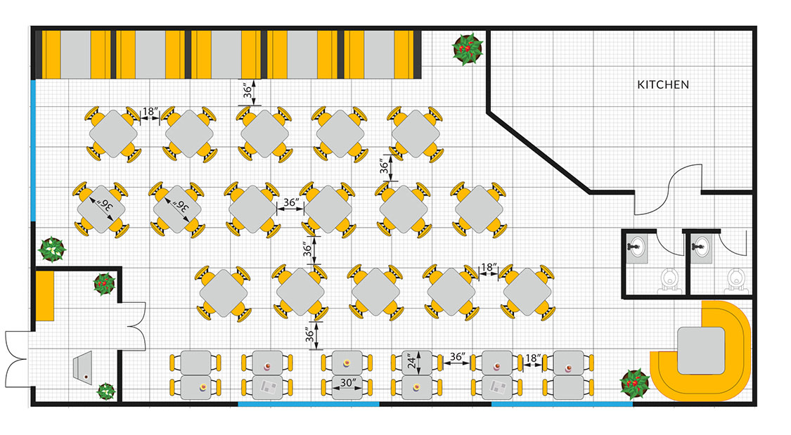
In the original setting, as seen in the diagram above, the restaurant is comprised of one large dining area with a mix of seating that includes booths on one side and tables and chairs sets on the rest of the floor with the kitchen and waiting area closed off from the main room. The dining area was setup to maximize the number of seats that can fit in. This setting is creating a crowded, cafeteria like effect. This is not conducive to reducing noise or creating an intimate dining experience. While there are booths along one of the walls and a large corner bench in the rear by the bathroom, the seating design does not create a positive flow. Guests usually do not enjoy sitting next to the restroom due to the high traffic and unpleasant smell. The kitchen is closed, which doesn’t allow effective flow of enticing aromas. The waiting bench at the entrance is a nice touch, but instead of having guests enjoying the look of the restaurant while they wait they all they can see is a wall and a small view of the interior through the doors behind the hostess area.
Visual cues are important when trying to attract and make an impression. The mostly straight walls of the kitchen and the waiting area fit into the classic "box" style that was traditionally used when designing restaurants meaning that the current design is lacking in any focal points to look at and offers no interest for the diners. This also can be applied to the lighting which in the existing setup is uniform across the room and creates a diner like setting but were changed and softened in the new design.
The Flip
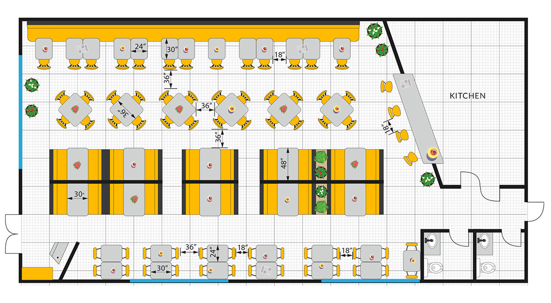
The booths along the wall were converted into a long wall bench with opposite chairs and tables. Wall benches are not just functional, they look good, are comfortable and most importantly they are popular with customers. Two rows of tables were removed and booths were placed instead with a low wall as a partition. The kitchen area was re-arranged and the separating wall was used to create an open kitchen design with a small bar area attached. The closed off waiting area was removed leaving only a small diagonal wall behind the hostess station. This provides the customers waiting to be seated a larger view of the restaurant while also exposing them to the smells and sounds of the food being served and eaten. We also added a small resting area for the staff to use.
The kitchen wall was placed at an angle as was the wall behind the hostess. The open kitchen and the low wall and booths separating the room help to create interest by breaking up the visual field, allowing customers to have different views of the room wherever they are looking. Sound is also an important part of the dining atmosphere and while some sound is welcome to help drown out diners’ conversation and allows for some privacy too much sound can create an unpleasant distraction. Using partitions in the room helps to break up the noise level and brings it down to a pleasant level.
Our diagrams are to scale and include furniture dimensions. If you wish to download them for future reference simply click on them and save to your computer.
To Sum It Up


We centralized the changes we've made in this restaurant flip as shown below:
- Entrance and Waiting Area - The waiting area at the entrance was "boxed" off from the dining area. That area was opened up leaving only a diagonal wall behind the hostess station exposing those who are waiting to the enticing aroma of food and allowing them glimpses of the dining area. This helps to create anticipation rather than frustration while having to wait.
- Dining Area - The dining area was comprised of five booths on one side of the restaurant while the rest of the space was occupied with tables and chairs. This created a large open space with nothing to stop sounds bouncing back and forth. By adding dividers between the booths in the center, noise levels were reduced while at the same time creating a more intimate dining atmosphere simply by creating the impression of having two smaller dining rooms rather than one large area.
- Restrooms - Behind the restrooms there was an area with one 3/4 circled booth where larger parties could sit in relative privacy. The booth was removed and the restrooms were placed in its place.
- Kitchen - After moving the restrooms we could change the kitchen layout making use of the space in the back and slightly enlarging the dining area. We also created a little more interest by making it into an open kitchen and adding a small bar area for casual diners and those looking for a quick bite.
Over all, while the new restaurant flip did not increase seating capacity it helped to create a much more pleasant ambiance with a modern up-to-date look that leaves a positive impression on customers and helps increase it's popularity and revenue.
NOTE: Redesigning a restaurant is expensive. Moving walls around, changing the location of plumbing and lighting fixtures, replacing and/or adding restaurant furniture, and of course, having to close down the restaurant during renovations all adds up but the end result is worth it when done right. Make sure you know your customers' preferences. If you are running a club with a dance floor you need to make sure the redesign reflects that. A fast-food restaurant, for example, will actually benefit from having one large open dining space and a mediocre interior. After you know that, learn what type of interior design best reflects your brand and food to see how you can incorporate that into your venue. Don’t be intimidated by change; change may be just what you and your restaurant need.
Whether you need help with your order, have more questions about our furniture and their custom options or want some advice about designing your restaurant’s layout, our professional team is here to assist you. Use our live chat or call (866) 832-1796 to talk to an expert. For extra read and information we recommend our Restaurant layout tips guide and our technical Restaurant design article.


