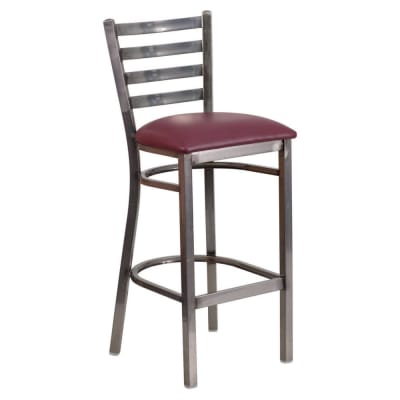
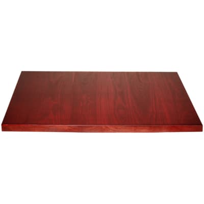
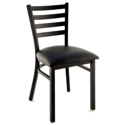
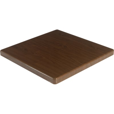
The appealing taste and look of Mexican food can make starting a Mexican restaurant a lucrative project. A Mexican restaurant design is summed up by bold colors, Native American/Latin influences and rustic furnishing. The menu, food, and drinks don’t bring a fiesta to the restaurant on their own. Iconic designs, lighting and decor contribute to the atmosphere as well. A well executed concept along with using the right elements can create a cohesive look for your Mexican restaurant and enhance the dining experience for your costumers.
Use of Colors and Textures
Woven textures with primitive prints and patterns and rich colors are key when it comes to designing a Mexican restaurant. A color scheme should already be set up before searching for furniture and décor as color depicts the beauty of a restaurant. If you have accent pieces like artwork, pottery or ornate furniture you want to showcase, the design should be kept simple. Restaurant designs generally rely a lot on color psychology. It’s a scientifically proven method that is commonly used by designers in the food service and hospitality industry.
Color scheme is a big part of a Mexican restaurant design. The color palette they select is thought to stimulate appetite, create feelings of pleasure and convey safety and warmth. These are all positive emotions guests want to feel when dining out. Best color choices for a Mexican restaurant design are:
- Red - red chili peppers are synonymous with Mexican cuisine which range from muted to bright red.
- Green - the colors of peppers (including jalapeno) yucca and cacti plants are prominent hues used in Mexican restaurant interior designs.
- Blue - this is a prominent color found in Mexican tiles and pottery designs.
- Yellow - this symbolizes the color of the sun as well as different hues such as gold for sunflowers - a popular color choice.
- Orange - this color conjures oranges, sunset, and colorful tiles.
- Brown - chocolate is a common image that comes to most minds and is an emotional response to this color.
- Orange-Yellow - a color that represents nacho cheese which most people associate with Mexican food. It is a popular choice for an adobe wall color.
Rustic Mexican Restaurant
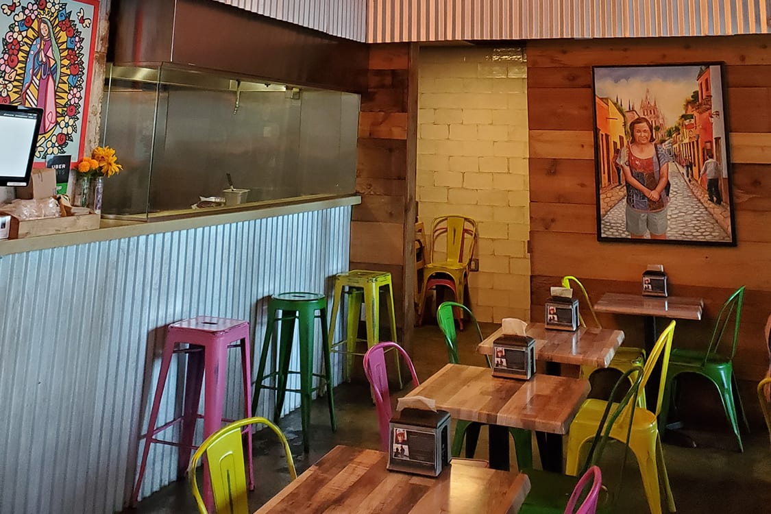
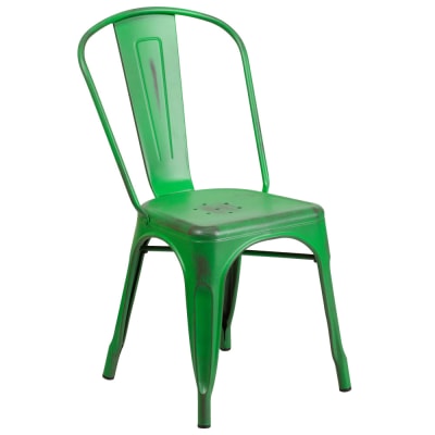
A rustic restaurant will have elements that include wood or wood-like materials, distressed looking furniture and design elements. Elements such as polished, acid washed concrete floors, the natural look of \wood on walls and tables. For example: in the image above, the corrugated steel and distressed bistro style chairs create the ambiance one would expect to find in a street food vendor in a rural, Mexican village. The wooden fixtures and murals also help meld the rural and urban design that creates an authentic Mexican look.
1. Colors and Decoration
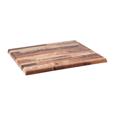
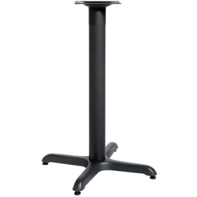
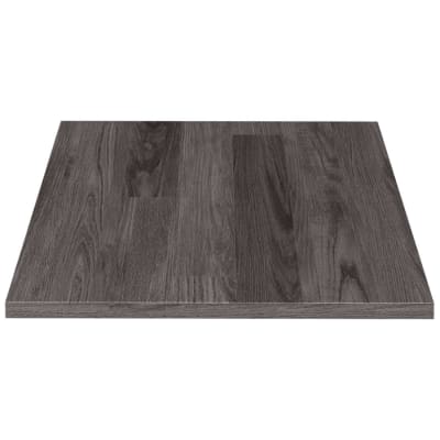
Tile trims and moldings are used on the walls. Wood grain patterns on the walls and laminated table tops give the interior a provincial look. Ironwork is one of the many architectural features in a rustic Mexican restaurant which can extend to the door, table bases and counter areas. Vibrant color seating brightens the warm color scheme.
2. Furniture and Layout
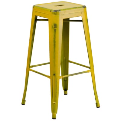
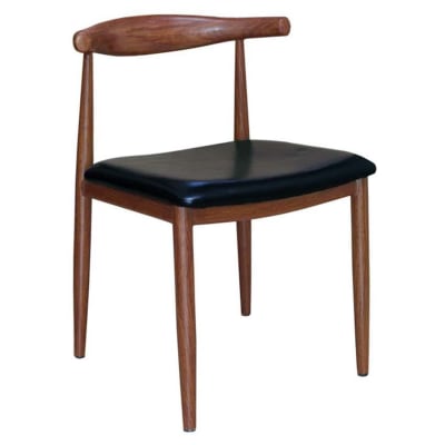
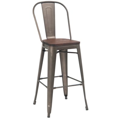
Colored chairs with a distressed look express the rustic character of the restaurant. Layout is cozy but not overcrowded. Matching backless bar stools bring cohesion to the decor and layout. Altogether the elements create the look you would find in an authentic rustic Mexican restaurant.
3. Lighting and Mood
With lighting as a big factor, the main purpose of a rustic interior design in a Mexican restaurant is to create an environment of pleasant simplicity and stability. Light enough to enjoy the food and ambiance but not one that would fully illuminate the interior.
Shop the Look
Modern Industrial Mexican Restaurant
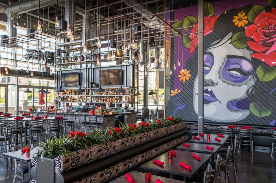
Getting the right look for a modern industrial restaurant space can be a gamble. Some spaces can be too masculine, feminine, modern or cold. Thorough research can help you find the perfect balance that works for your space. The above Mexican restaurant design is a great example of a modern industrial interior that is well balanced and perfectly put together.
1. Colors and Decoration
The cool color palette is set up by dark gray concrete floors, metal-wood furnishings, and steel shelving units to emphasize the sleek modern look. Shades of gray are repeated throughout the room including the booth upholstery. Colorful wall murals add depth to the design and lustrous metal finishes compliment the industrial elements. The rich wood creates a wonderful contrast with the industrial features.
2. Furniture and Layout
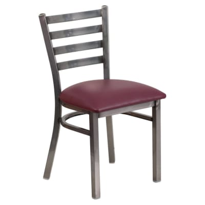
The layout assures that there is enough space for tables. The way industrial elements like solid wood plank tables, clear coat ladder back chairs and steel columns incorporated into the design play with the industrial feel of the space. Custom booths are neatly lined up against the walls and the shelving unit that serves as a bar ties the décor together throughout the entire room.
3. Lighting and Mood
Another important aspect of the restaurant interior design is the light. Dimmed illumination with soft music or quiet melodies in the background set the mood. Metal fixtures suspended from the ceiling create a modern industrial look and large windows open up the space letting in natural light to brighten up the cool interior.
Shop the Look
Classic Mexican Restaurant
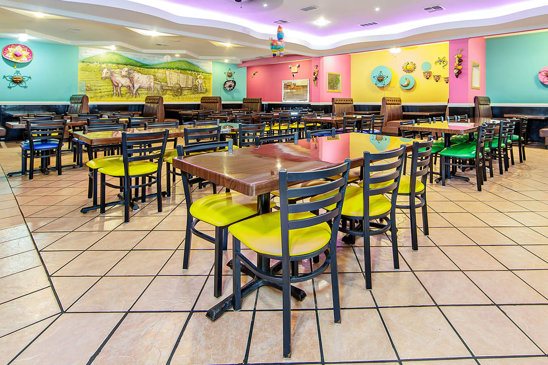
The design in a classic Mexican restaurant has an eclectic feel, mixing rustic wood with wrought-iron or metal furnishings with bright, vivid colors. It incorporates elements from Spanish conquistadors and missionaries who came to colonize and settle in the Americas. The look also blends design elements from the Native American tribes living in central America, including the Aztecs and the Mayans. The combination of Spanish European architecture and native tribal culture in a classic Mexican restaurant design is one of the most beautiful and colorful work of art an decor found anywhere in the world.
1. Color and Theme
The interior design is a mix of modernity and functionality with representations of Mexican culture. With use of bold and playful colors throughout the space, graphics and branding are also incorporated to help solidify a Mexican festive feel making the design warm, casual and inviting. This is achieved through using a combination of organic and utilitarian elements such as ceiling light fixtures, diamond patterned stone flooring, and metal-wood furnishings. The goal behind the classic Mexican restaurant design is to create a space that envelopes a person with different visual experiences. Traditional Mexican architectural elements are taken and reconfigured as “Pop Art” furniture and lighting.
2. Furniture and Layout
Choice of furniture and layout of a classic Mexican restaurant is similar to that of a family-style restaurant which this particular restaurant is thought to be. While the restaurant seating style is cohesive with the restaurant’s décor and color scheme, it is also supposed to stand up to the wear and tear in high traffic environments which most family style eateries are. Resin tables and metal ladder back chairs are a great choice as they are resistant to scratches, spills, burns and rust. Because there is a lot of turnup at such restaurants, booth seating is also provided to maximize seating capacity.
3. Ambiance and Lighting
Bright lighting indicates a lively and energetic environment with high turnover. The atmosphere of a classic Mexican restaurant is the one that makes guests feel welcomed and relaxed. During weekdays and when service is less busy, downtempo and traditional mariachi music is played to create a pleasant and relaxed environment. A playlist of Latin-pop music is used on the weekends when guests visit for drinks to help create a focal point for socializing and having fun.
Shop the Look
Upscale Mexican Restaurant
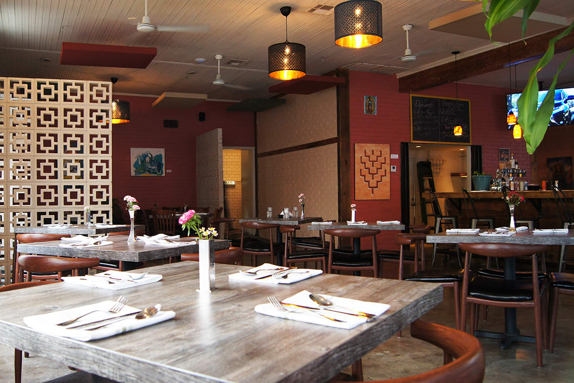
Like any upscale restaurant a Mexican restaurant needs to convey the right message using the proper visual cues. This doesn't mean that there should be no ethnic decorations or motifs but they need to be toned down and carefully applied. For example, instead of bright large murals Mayan and Inca geometrical patters can be used.
1. Color and Theme
Reminiscent of Mexico City’s Condesa district, the interior design employs a two-toned color scheme with a mix of exposed brick walls, rustic flooring, 1920’s art, and beams that are reminiscent of historic Latin architecture. Brown is commonly used in fine dining Mexican restaurants’ color scheme as it releases a feeling of warmth and security which most upscale establishments want patrons to feel. The space is divided in to areas with rustic accents while the area as a whole has an open yet cozy feel.
2. Furniture and Layout
As in most upscale locals wood is commonly used. Wood furniture and wood looking furniture give the interior a warm look that help customers to relax while enjoying a high end meal. Table decorations like miniature flower vases, glassware and silverware lend a fine dining look to the overall design. Lamps or candles on the tables help enhance the ambiance as well as evenly distributing light throughout the place. Square patterned partitions not only elevate the design but add symmetry to the room as well as creating an intimate comfortable dining space.
3. Ambiance and Lighting
Romantic and intimate mood is set by dim lights and candles as you would expect to feel at any fine dining establishment. Table cloths and lanterns enhance the feel while emitting a come and stay aura. Pendant lights bring vibrancy to the space without being too blinding. Soft guitar Mexican background music helps diners relax and enjoy their meals while creating a more authentic atmosphere for the food being served.
Shop the Look

