A design for a small restaurant can be functional and beautiful depending on how well conceptualized and executed it is. Whether you are opening a new establishment or remodeling an existing building, many challenges lay ahead in developing a layout and design for a small restaurant. Even running a small restaurant is a challenge unto itself. Having to manage the flow of customers and wait staff with a limited space can be tricky. A conscious decision is required for a small restaurant layout and design, especially with new regulations and measures for safety from spacing restaurant tables to zoning areas for food delivery and service. With the right design touches (and making sure they coordinate with the safety regulations), you can turn your small restaurant into a profitable business and a social hub that people will talk about. Below are several inspirational small restaurant design ideas you can implement.
Upscale Small Restaurant Design
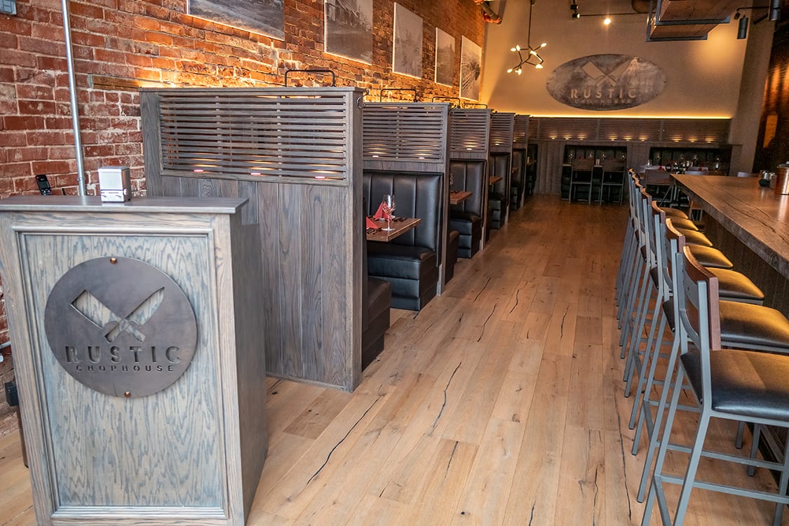
An upscale dining setting allows you to make the most of your small location. People are willing to pay more for an experience that provides them with luxury, comfort and great food. For that you need to maximize your limited space by using restaurant booth seating, private setting and intimate lighting. In such cases wood is your best option. It exudes warmth, does not reflect light but rather helps mellow it down by adding deep gold hues and absorbing sounds.
1.Partitioning and Flow Control
As a general rule, the floor plan should dedicate enough room to create seamless flow, especially at a small restaurant. Adding ledges and small partitions behind the hosting stations help ensure that. It also showcases the atmosphere of the dining room and/or bar. You can include different wall art and decor that synchronizes with the restaurant’s theme. Booths or wooden benches placed closely to the walls allow staff and customers to easily move around without interfering with the flow of service at a small dining establishment as opposed tables and chairs placed in the center of the dining room.
2. Lighting
Dark color themes are not recommended for a small restaurant’s interior as they enclose and trap light as well as make the space look smaller than it actually is. Good lighting creates ambiance for your guests. Soft light, exposed bulbs or translucent ceiling fixtures will open up your small dining area. Light bounces off the room, creating an illusion of a larger space. Warm light helps a lot to create a high-end upscale atmosphere at your restaurant.
3. Color Palette and Decorations
A high-end small restaurant is carefully designed to provide a luxurious escapade to customers. Dining at this restaurant is a holistic experience that offers sophisticated service with best quality food you would expect at a fine location. Earthy tones, brown and soft yellow shades with exposed brick walls and black & white photos highlight a smooth, rustic, and upscale look. These design elements make the room look larger without obstructing the view.
Urban Industrial Small Restaurant Design
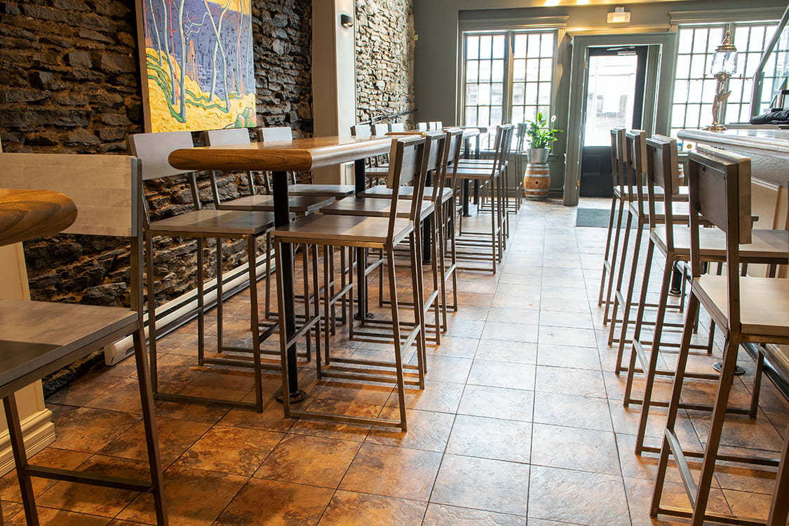
Many restaurateurs and commercial designers appreciate the visual appeal of an industrial decor. This design links light tones of the wooden restaurant furniture and compliments the darker finishes of the bar counter area and the wall color by the entrance. Intended to be used for dining and casual meetings, the urban design serves as the venue’s heartbeat. The design channels the idea of neighborhood - bringing people together with warm and rustic decoration elements.
1. Partitioning and Flow Control
The urban industrial look is characterized by an open space feel that is void of partitioning. Seating arrangements and layout, when done correctly, are designed in such a way as to provide enough room for staff and customers to move around. A counter style bar seating area facing the street window so customers can get a good view leaves more floor space. Modern and sleeker restaurant seating options are a better choice for furnishing urban small eateries.
2. Lighting and Vibe
Natural light works best for urban industrial style small restaurants. You should use your window space wisely or consider investing in installing larger windows to let the natural sunlight in and brighten up your room. At night, large bright lighting features are the best way to make the room seem larger.
3. Color Palette and Decorations
Industrial design in a small restaurant commonly uses right angles, bright lighting, and earthy color palettes which creates an interior that looks airy and spacious. Neutral earthy tones, exposed brick walls and minimal wall decorations give the dining room a clean and uncluttered look. Floors with certain patterns - a mix of dark and light - gives a dining room the pop it needs as well as creates the desired atmosphere.
Diner Style Small Restaurant Design
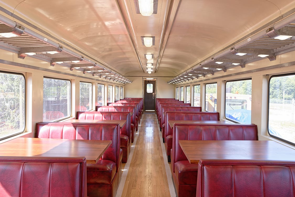
Small restaurants, especially diners, relay on a fast turnover and returning customers. Apart from excellent service and great food, diners need to provide comfortable furniture that blends with a neutral interior that is meant not to keep customers around too long. This can be achieved with a spartan interior that makes guests feel welcomed. Diners are all about welcoming vibes and modern lines characterized by nostalgia from the 1950’s.
1. Partitioning and Flow Control
Commonly used in any small dining spaces, booths are a preferred and logical choice for restaurant seating in a diner. Double booths especially maximize seating without using a lot of space. They also can function as a partition between diners. These types of booths are practical for train car style diners where the dining room is very narrow with an isle in between - similar to the design of an actual train car.
2. Lighting and Vibe
Bright lights and large windows are a staple at diners. The atmosphere of a diner is not meant to be intimate but rather more open. It is the one that encourages high table turnover. A diner is an oasis for hearty meals shared with families and friends. Comfort and functionality are the focal points in a diner. Accent pieces like lamps with a mushroom or geometric design in bright colors illuminate the retro look of a diner.
3. Color Palette and Decorations
Diners in general aim for bright and vibrant colors like red or green, mostly for the furniture and decorations. Walls are typically off-white or creme colored. This set-up helps create a lighter and brighter interior that looks larger than it really is. In general, retro interior diner decorating heavily relies on reproductions and old pieces. When you think of a retro style diner, for example, design materials, textiles and elements like chrome, vinyl, Coca-Cola logos, and 1950’s
memorabilia come to mind.
Themed Small Restaurant Design
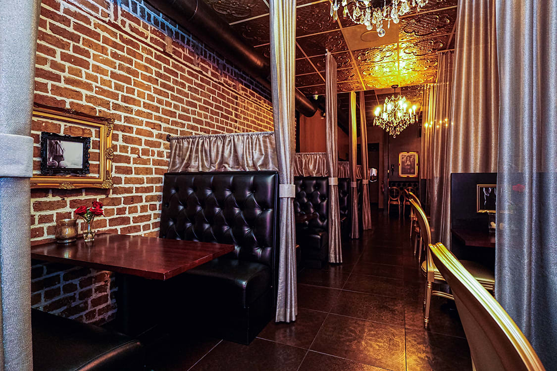
The lines are often blurred when it comes to the rules for designing a themed small restaurant. Even so, smart use of mirrors, floor plan, furniture, decoration items and lighting can make the dining room appear bigger than it really is. It’s important that the theme you choose conveys the right message to your customers. You want to create the right mood while staying true to the theme and mission when designing your restaurant.
1. Partitioning and Flow Control
Flow control is always important. Partitioning should depend on and match with the theme. For instance, if you are going for a high-end dining experience and want to create a romantic atmosphere, partitioning should be planned accordingly. Walls, even with thin wood partitions, will obstruct the view and make the room appear smaller. Use of fabrics and movable curtains to separate the room into smaller areas allows you to open up the space a little more when not fully booked.
2. Lighting and Vibe
Depending on the restaurant’s theme, lighting can be bright, or dim and dark. When you are trying to create a more intimate dining environment, use dim lighting and add mirrors on the walls and candles to make the dining room look more spacious and inviting. Or you can install bright lights to create a more energetic atmosphere when not looking for an intimate setting. Accent lighting showcases the architectural beauty in the restaurant.
3. Color Palette and Decorations
The color palette you choose should reflect on the theme. Dark and earthy shades seen at a fine dining restaurant give a feel of coziness and privacy. Bright shades increase appetites and are mostly used where turnover rate is given a high preference. Use of decorations in a themed restaurant are required but should be strategically arranged in a way that doesn’t make the dining room appear too cramped or cluttered.
Products Related to this Article


